The PROBLEM:
Daals’ new warehouses require a new signage solution that clearly identifies its premises without drawing unwanted attention. The ownership group wants signage that is functional and findable, but deliberately low-key: no large formats, no overt branding, and no high-visibility placements such as roof-mounted installations.
The Solution:
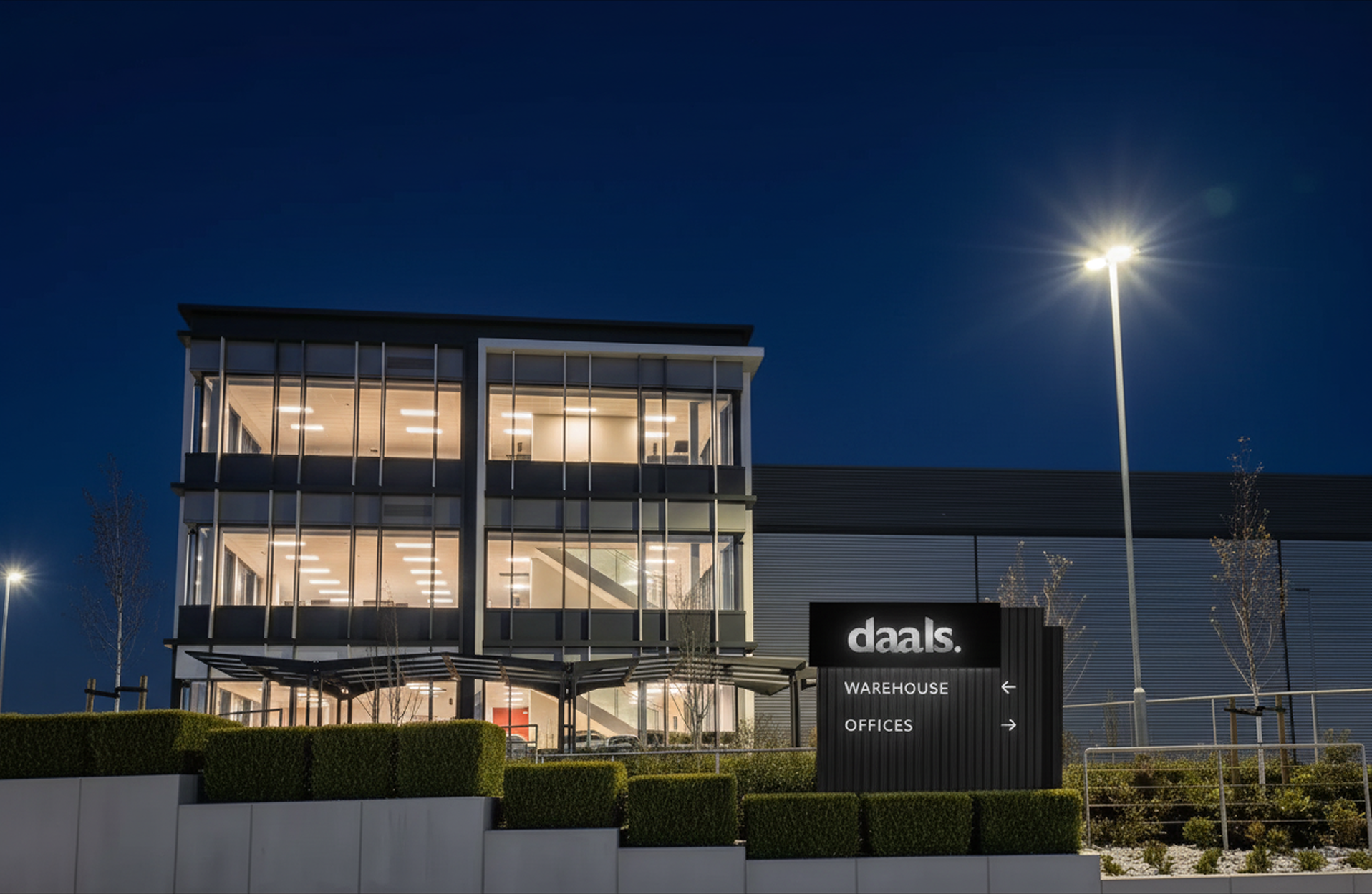
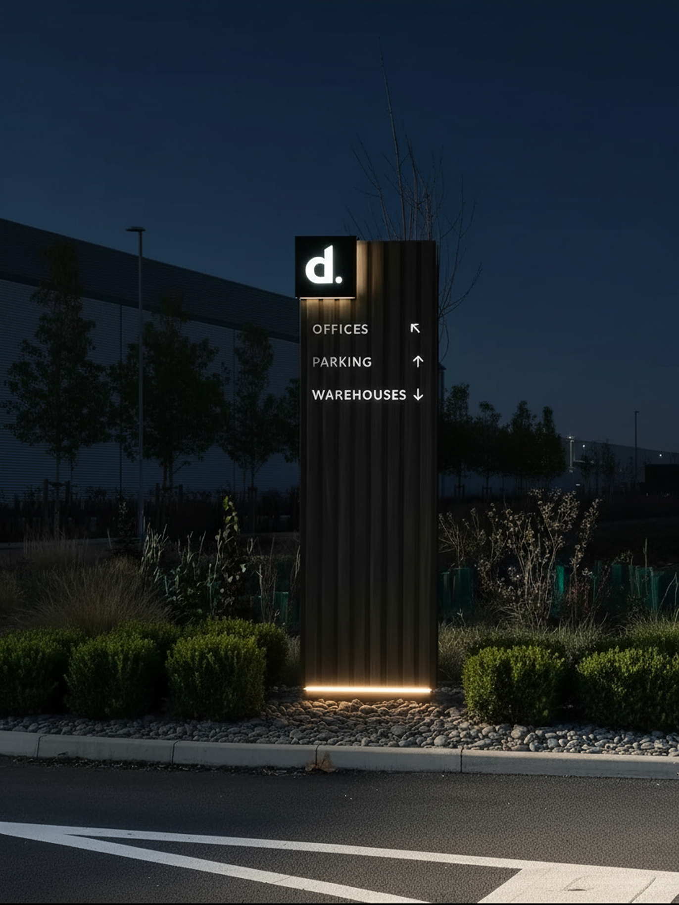
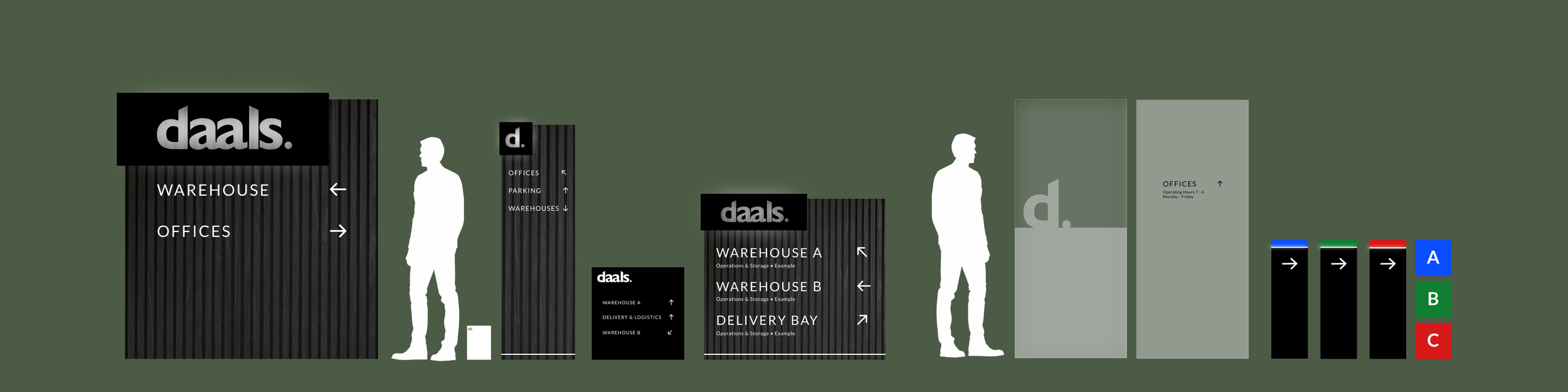
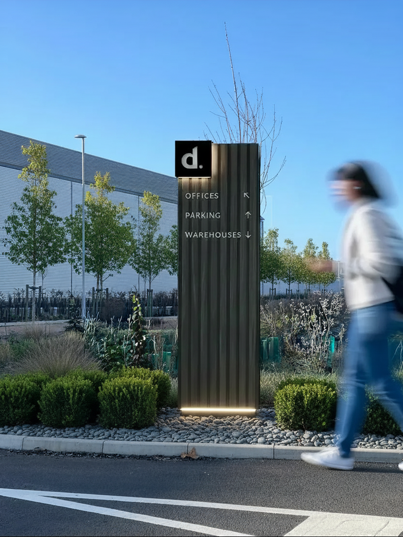
Black was chosen as the core material decision. It sits well against contemporary industrial architecture, reads clearly at distance and in low light, and carries a quality signal without being overly decorative.
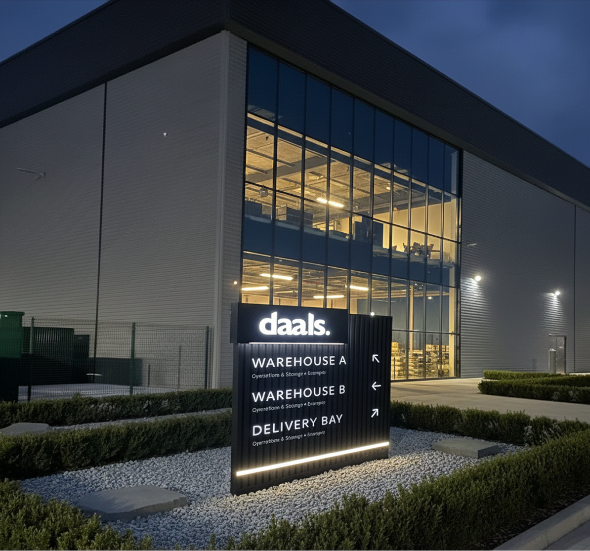
Rather than treating this as a branding exercise, the solution was built around wayfinding first. A tiered system was developed: primary entrance panels for first-touch orientation, transport-specific signage for logistics and delivery routing, secondary totems for parking and site navigation, and interior glass manifestations for the office threshold. Brand presence is handled through a single consistent mark, either the full wordmark or the reduced "d." monogram, so the identity is present but not overt.
A coherent system that scales from gate to office door, serves every user type on site, and keeps the ownership group's preference for restraint intact at every touchpoint.
The same restraint that governs the exterior is maintained for the interior wayfinding system.
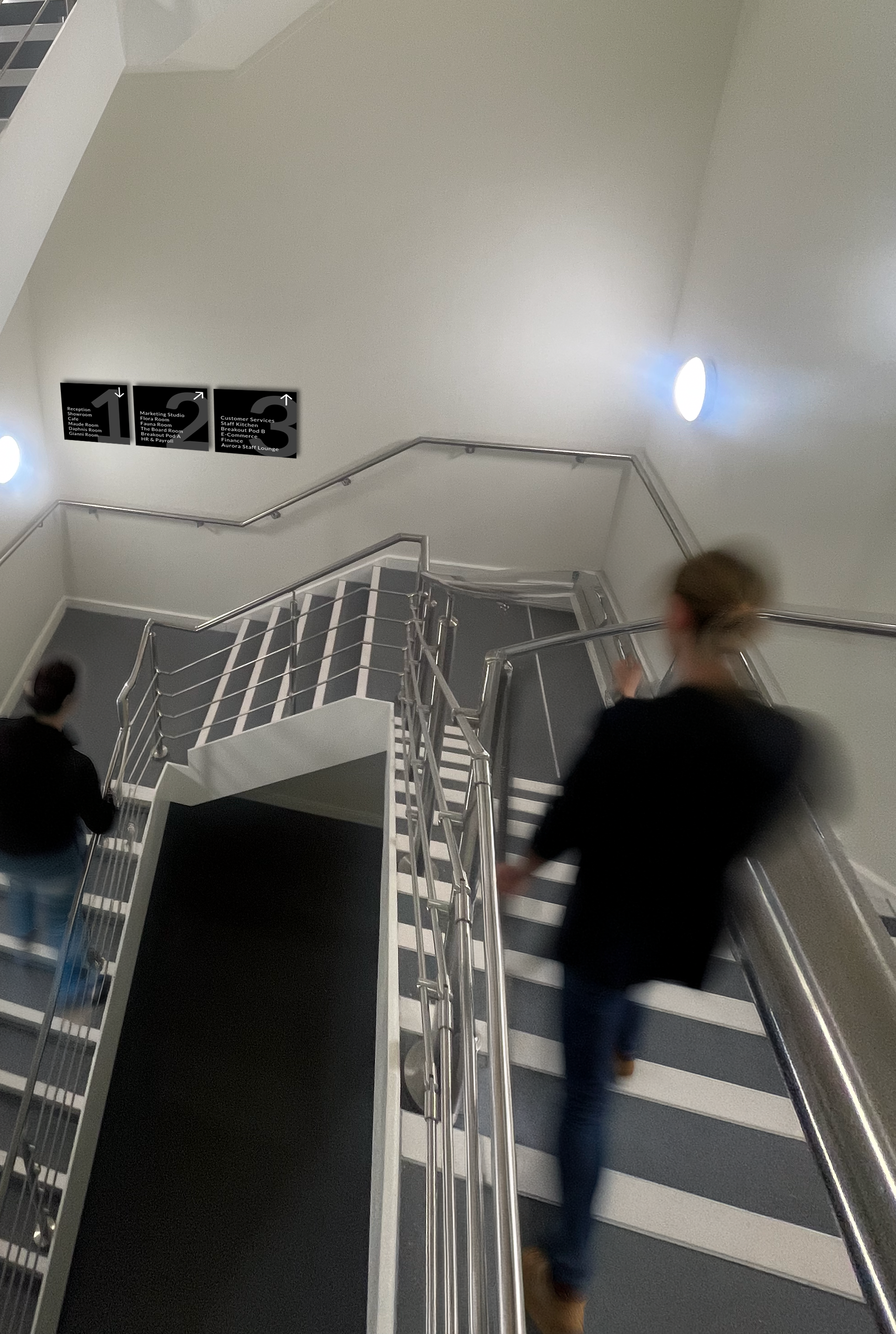
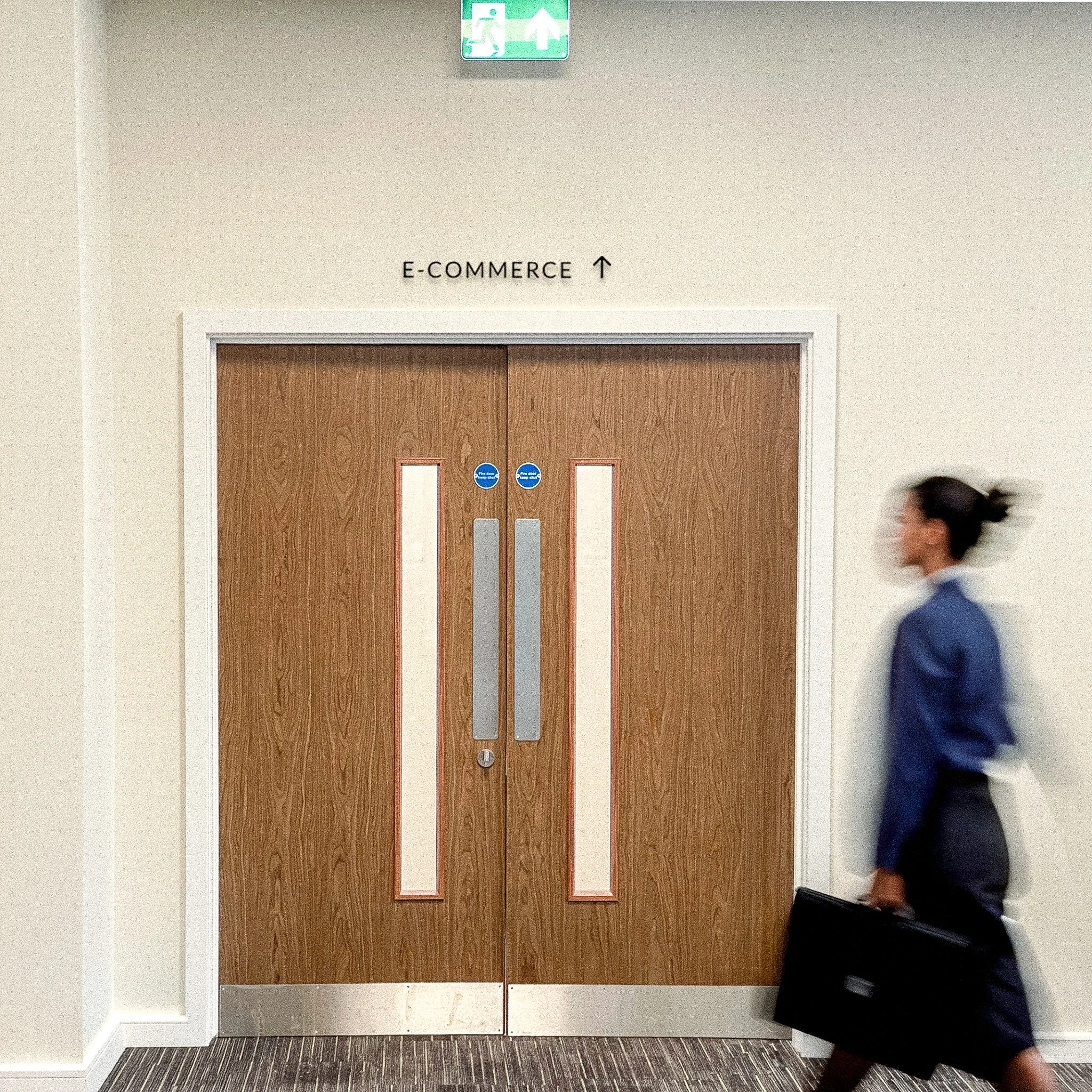
Wayfinding panels direct movement at the stairwell, pictogram plaques identify facilities and access points, and minimal room-level labels sit above doorways
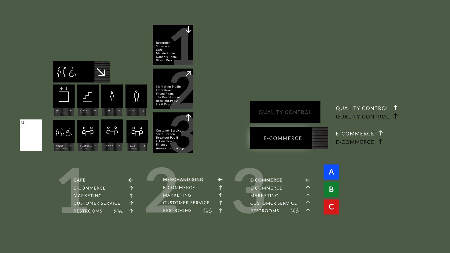
The pictogram set was designed from scratch rather than pulled from a stock library. Each icon was drawn to match the weight and geometry of the typeface used across the wider system, so the two elements sit together as a family.