The PROBLEM:
The brief required a campaign that would grow the email list, increase site traffic, and generate revenue without simply leaning on a sale mechanic. The single campaign idea had to stretch across six distinct channels without losing coherence. The visual language needed to feel consistent, whether someone encountered it as a boosted social post, a DM, an email landing in their inbox, or a pop-up appearing mid-browse.
The Solution:
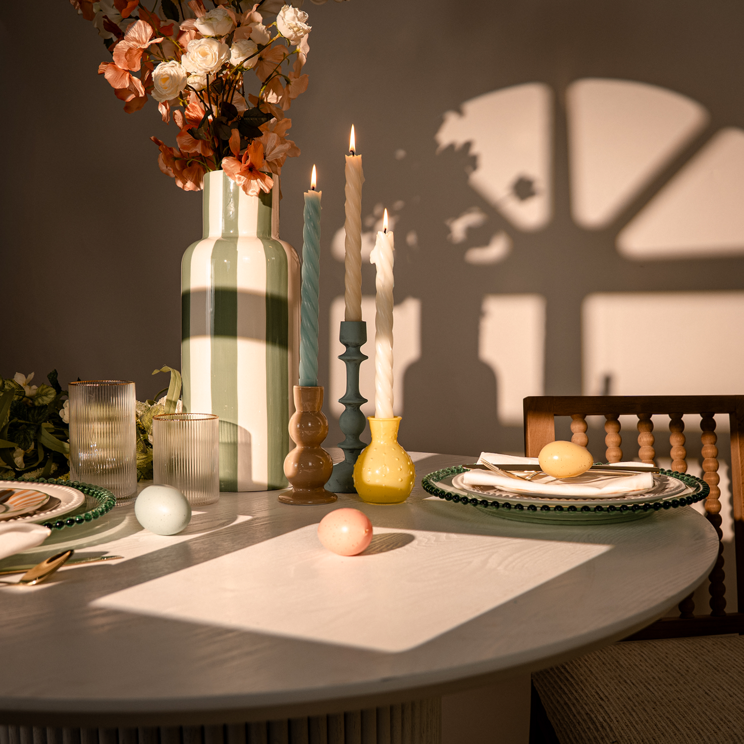
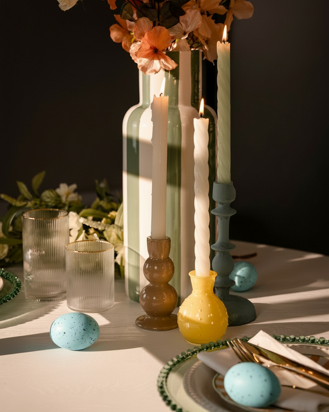
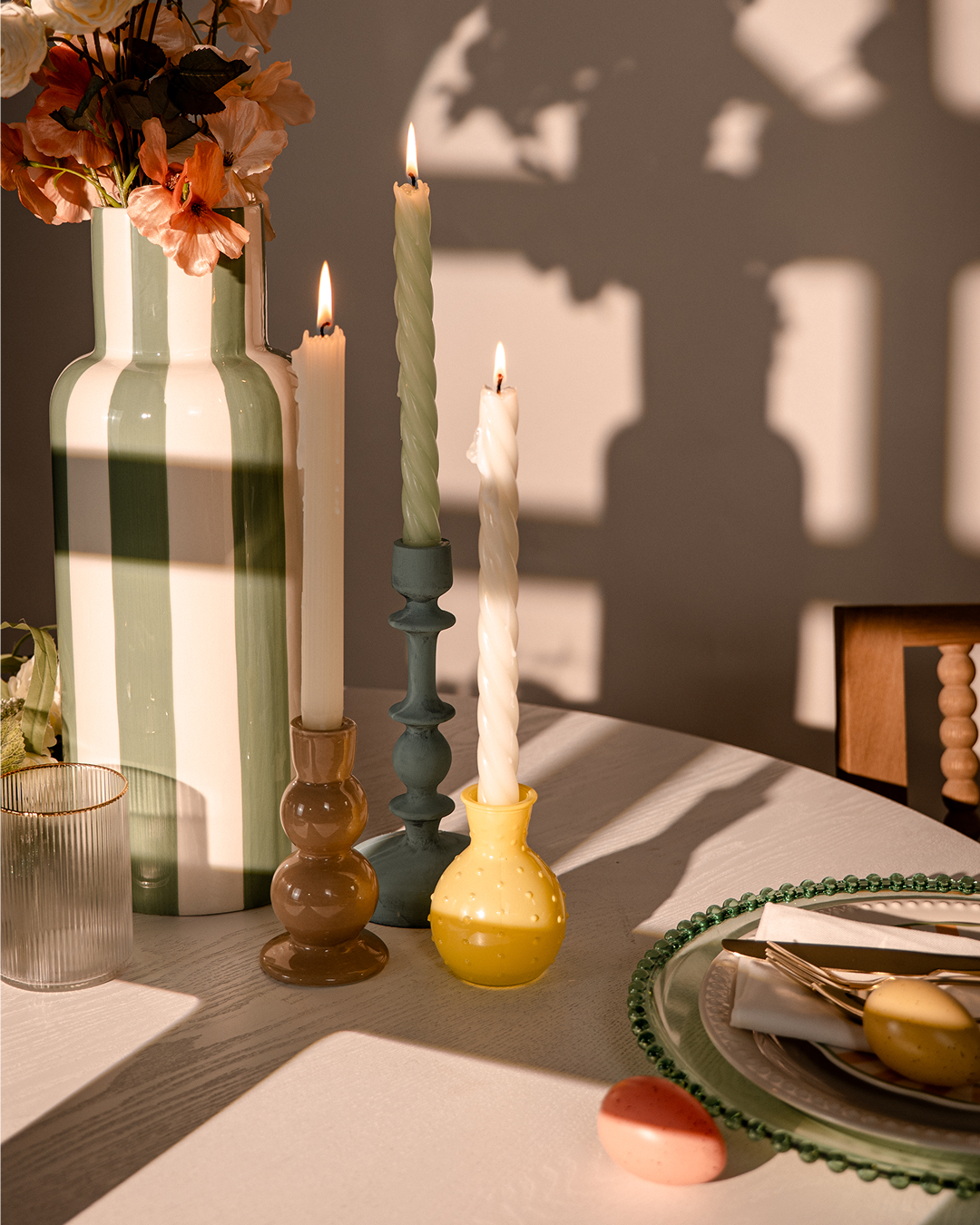
I began with a distinct hero image which was used to fuel the colour palette for the campagn and from there two distinct photographic registers were used.
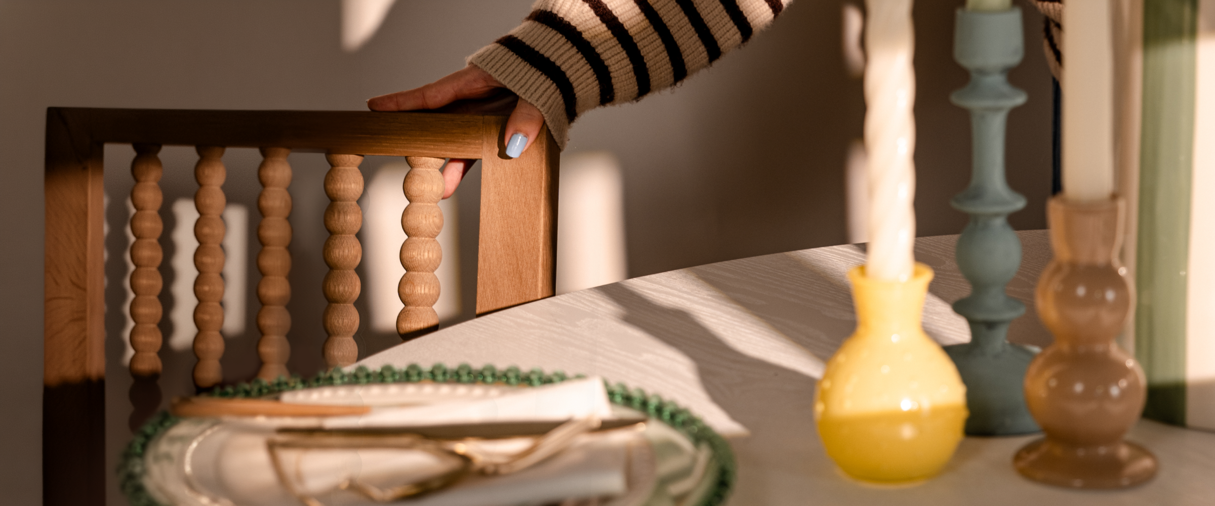
The top-of-funnel imagery was a take on product lifestyle: we decided to go with a clean open vision. I utilised wide compositions with space to breathe, products placed as though the home was already lived in.
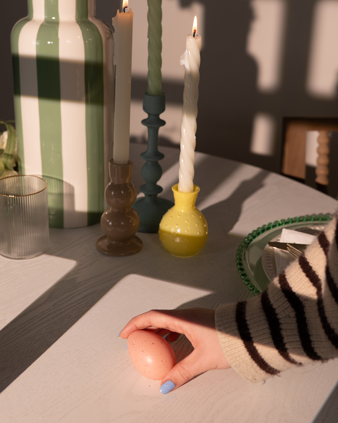
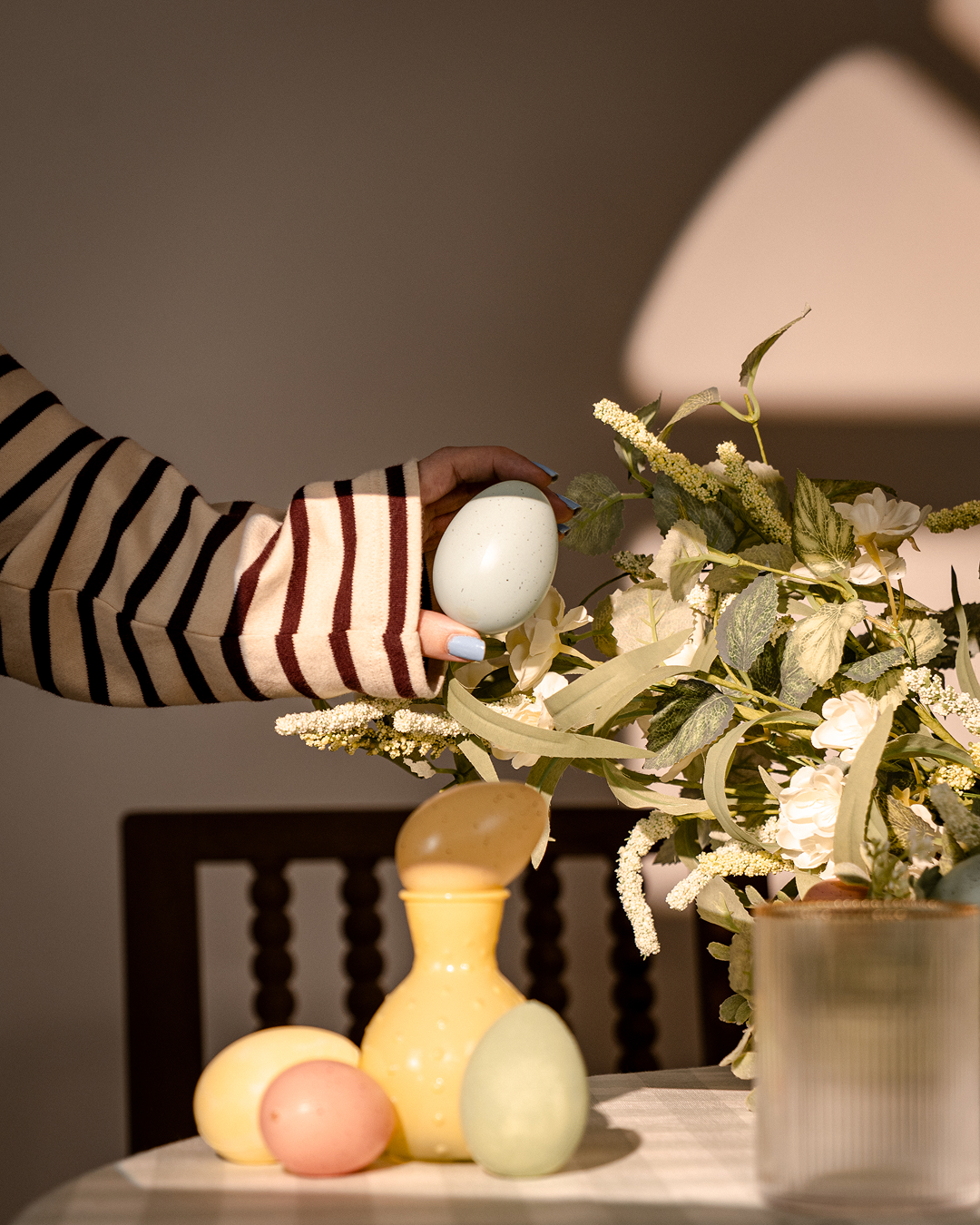
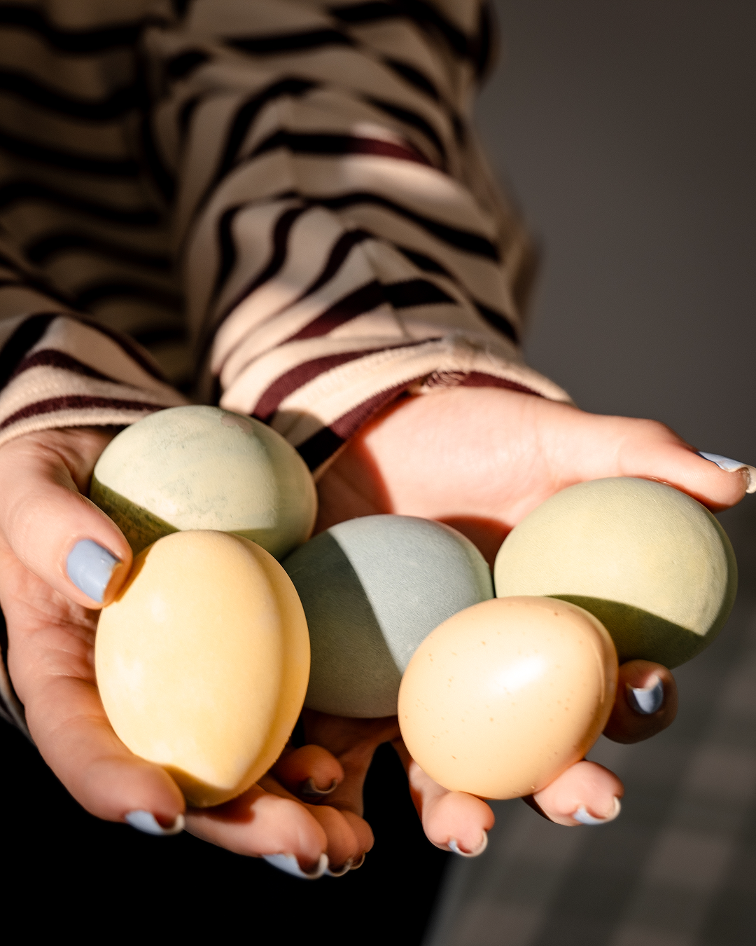
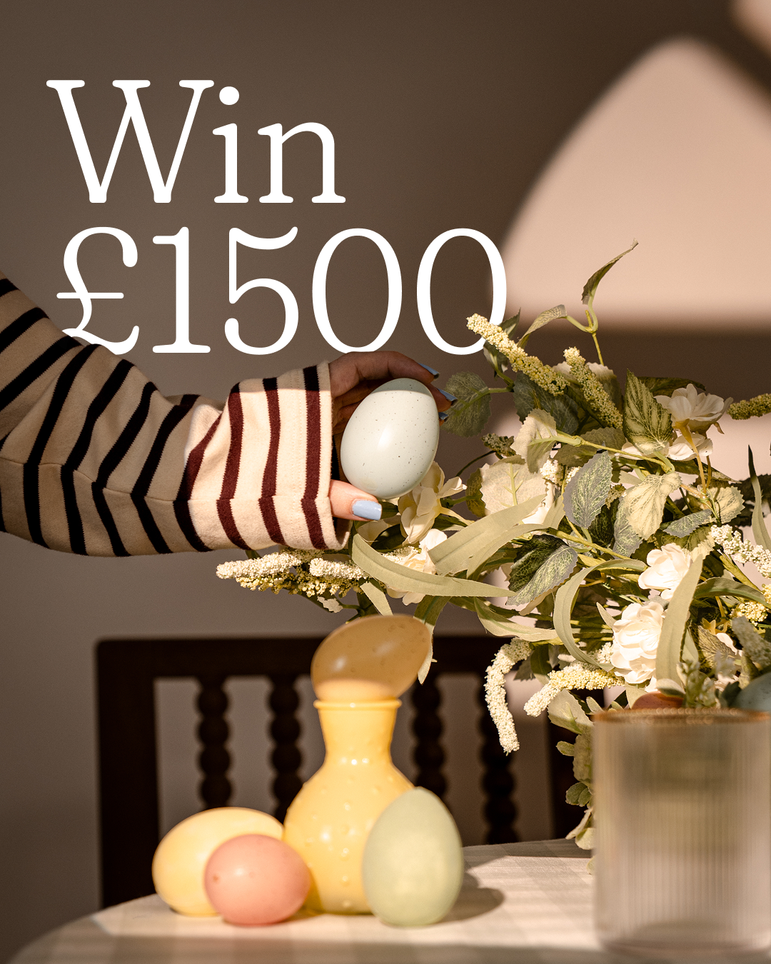
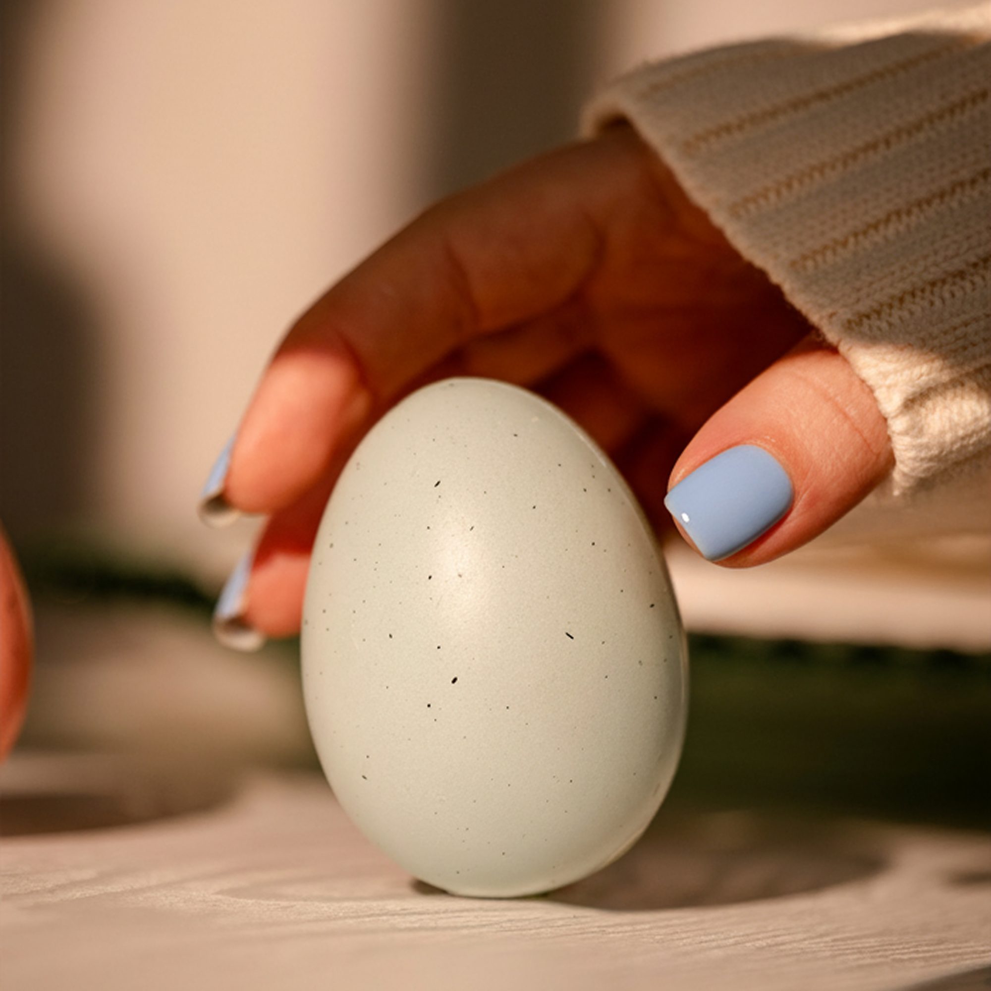
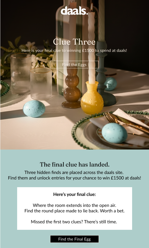
The mid-funnel work introduced a human presence, a figure at a table, a hand near a product, a person moving through a space. These shots were deliberately soft in focus and motion-blurred in places, creating a sense of discovery rather than presentation. While shooting this, I wanted the imagery to play on that sense of discovery and searching rather than posing.
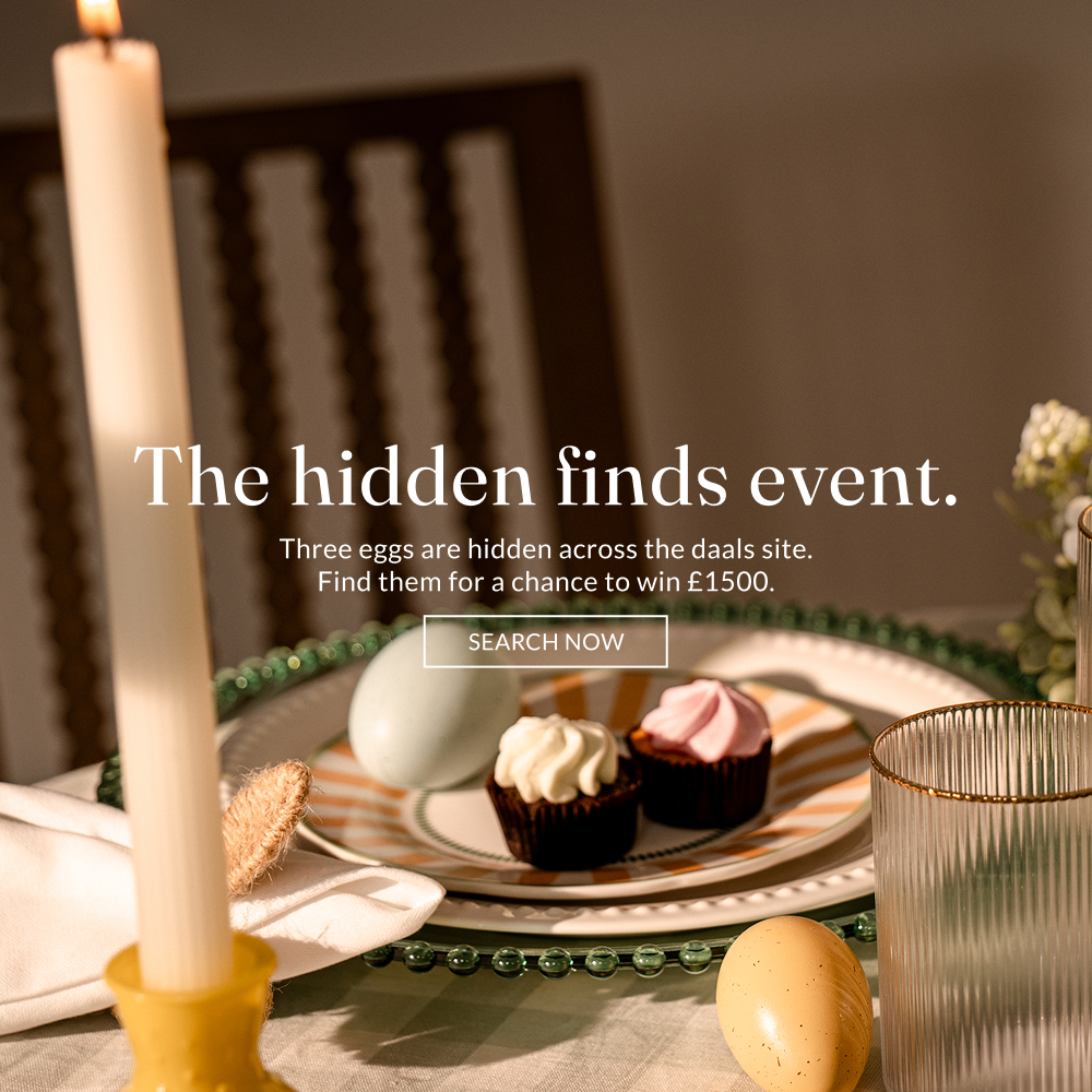
From there, I was able to establish the components that would work for the remainder of the channels in the campaign. Utilising the palette from our hero, our CRM, Email, and Social Channels were able to utilise imagery alongside graphic elements I developed to disseminate the promotion across their channels.
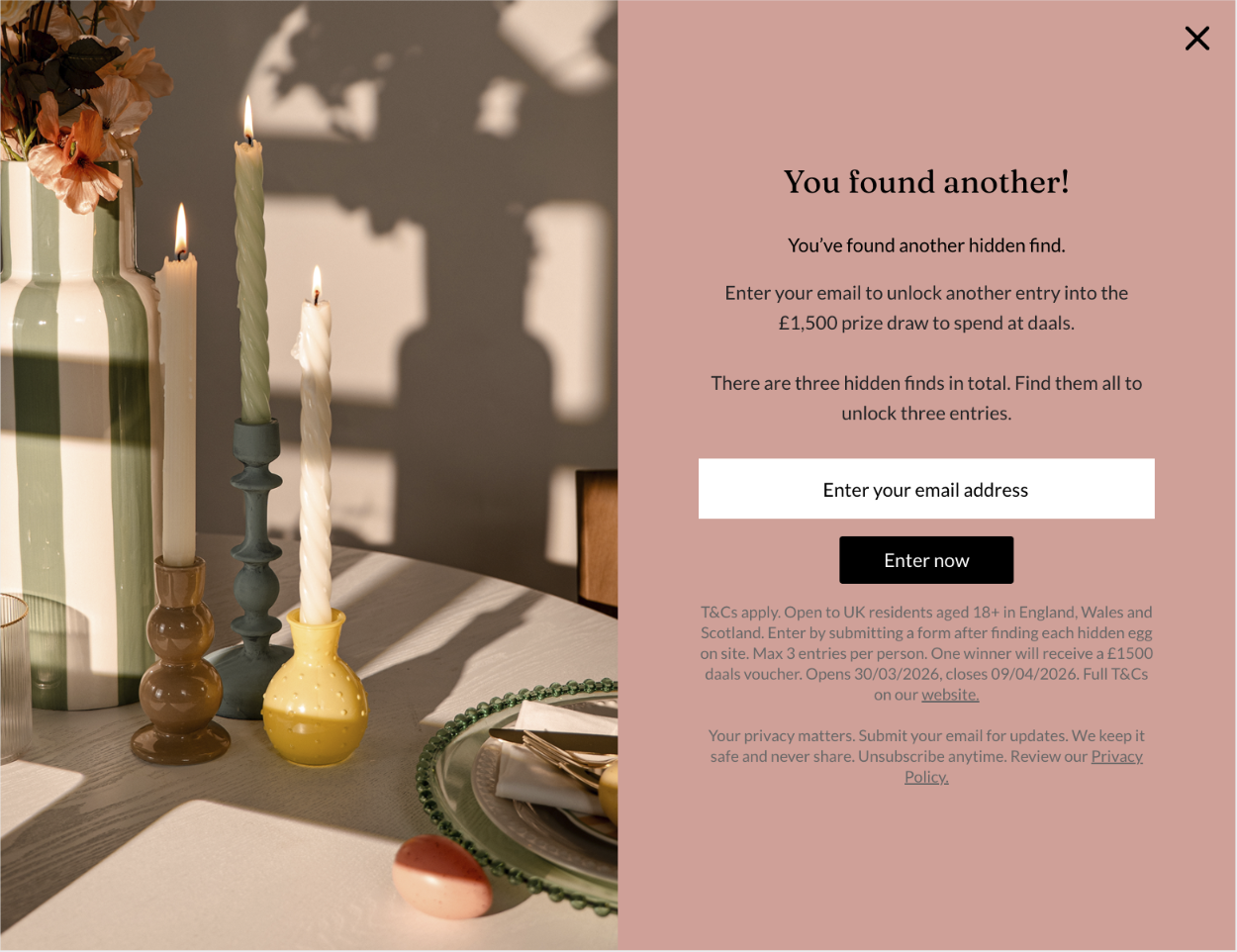
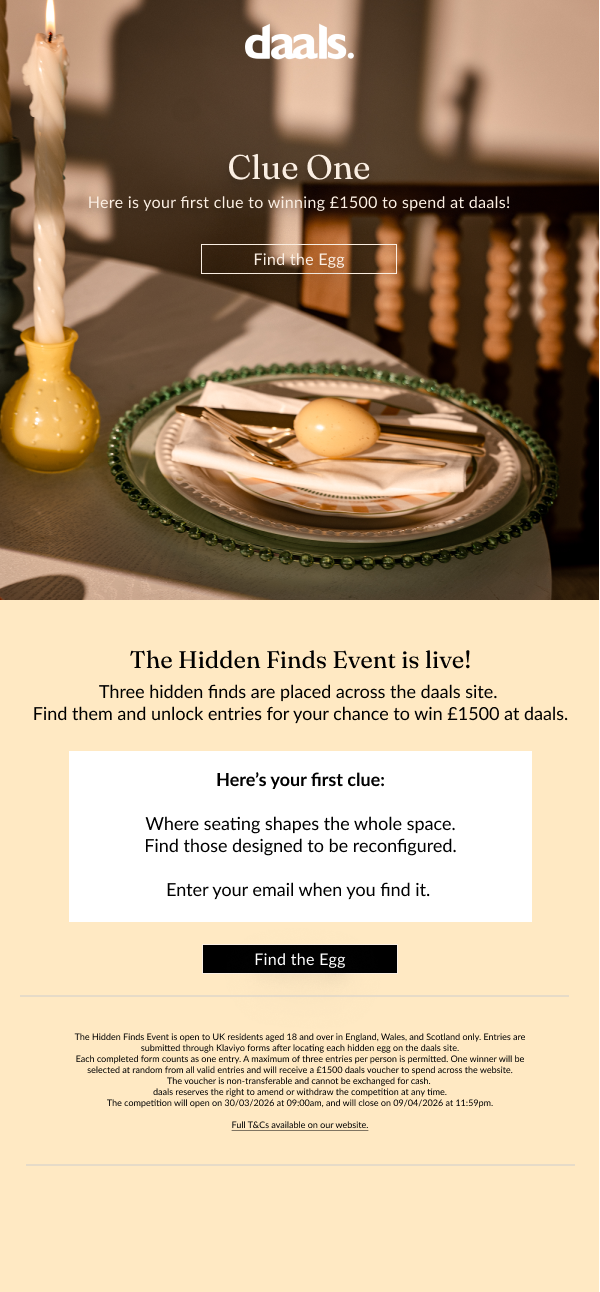

The typography was kept to a minimal set of weights and sizes. Large display text carried the key campaign lines at full scale, "WIN £1500" and "EGGSPLORE" used as graphic elements in their own right rather than just functional copy.

The egg itself was treated as a graphic device: simple, outlined, never overly illustrated. It appeared consistently enough to become a recognisable symbol of the campaign without ever becoming cartoonish.